

TIMSCO | Rebranding

Timsco had developed the first ever property finance comparison site. They had a clear vision and big ambitions, but lacked the brand to get them there. The world of property finance is murky and confusing. It is heavily weighted in favour of brokers. Timsco has created a platform to flip this on its head. We needed a brand that truly reflected just how monumental a shift for the industry this would be. We created a brand that felt contemporary but also rooted in the experience of its founders. Our platform was developed to unapologetically challenge the status quo.

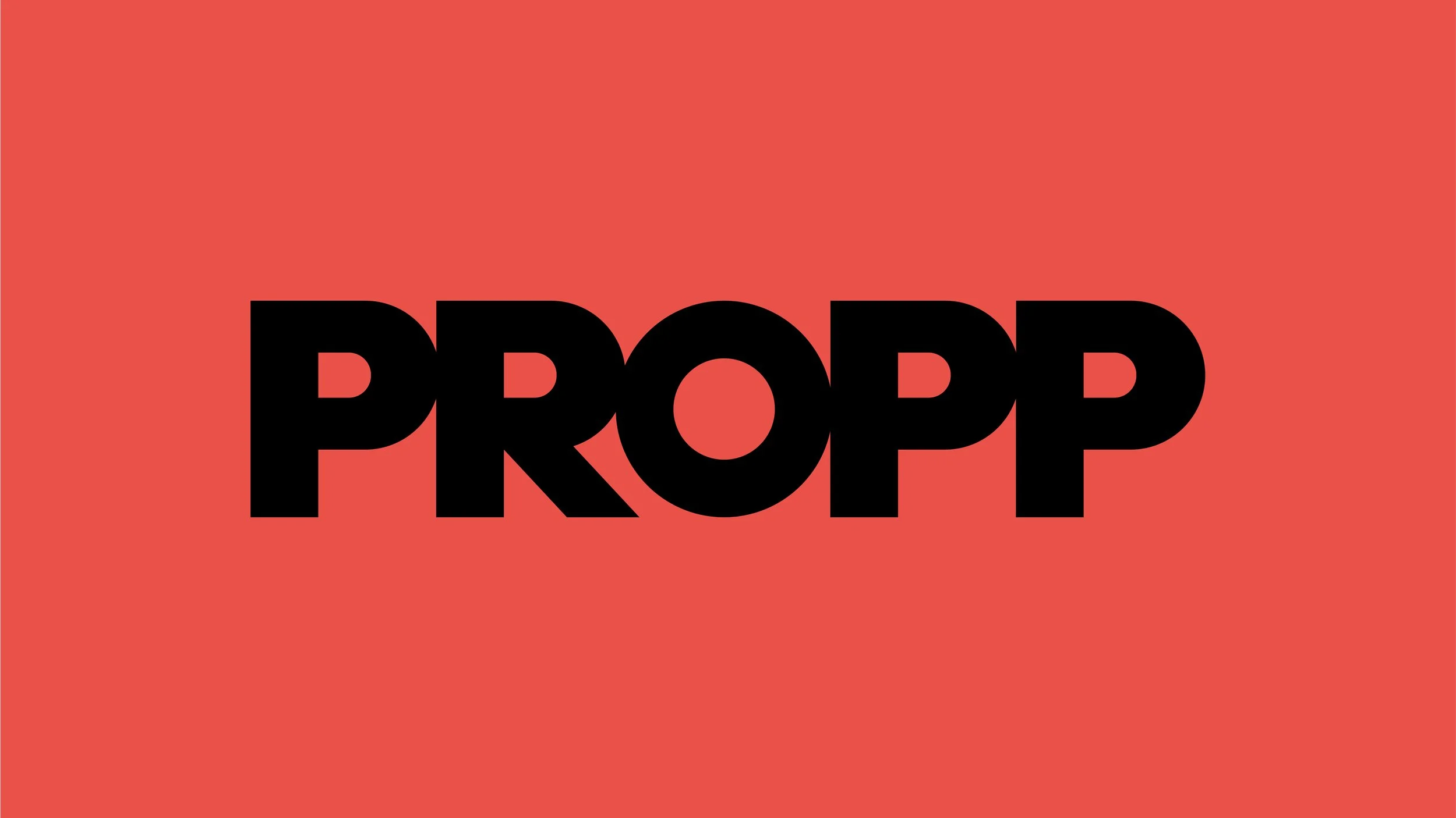
We developed a range of potential names. PROPP won out. It’s short, memorable and easy to understand. It felt contemporary without the fear of becoming quickly outdated, and it’s strongly connected with the industry itself.
We wanted the wordmark to reflect the brand, so we stripped it back to a simple form, but also tightened the individual letters to show how they supported one another (or propped each other up).


Brand positioning
Propp is built on a foundation of transparency, we believe in doing things the right way, or in other words, ‘Property Finance done Propperly’.


Tone of voice
We wanted the usage of ‘propp’ to be flexible and fun, with the aim of ingraining the word within all of our communications.

Brand launch: If we truly want to shake up the industry, we knew were we had to start; we targeted the out-dated, broker-led approach to property financing.


